Virtual Tour
Suite A-258
Quick Tips
- Always name your Virtual Tour components based on the content they contain–that way, you’ll be able to more easily identify them from the backend.
- This component is available on Full-Width content sections and Two-Thirds Width content sections.
The Purpose of this Component
The Virtual Tour component should be used to showcase the Worcester State campus, the inside of a building or residence halls. This allows the user to view the Worcester State experience.
An Example of The Virtual Tour Component
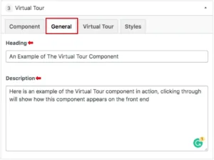
Here is an example of the Virtual Tour component in action, clicking through will show how this component appears on the front end
How to Use the Virtual Tour Component
When a content manager selects a Virtual Tour component from the component dropdown list, they will see four tabs within the component’s settings. The first tab reads Component, and this is where content managers will name their components internally on the backend. This setting is for organizational purposes, and this information will never be public to users on the front end.
 The tab to the right of the Component tab is the General tab, where the content manager can specify a heading or description text for this component if they choose. This tab does not have any required fields, meaning that the content manager can leave it blank if they choose or if it makes sense in terms of content.

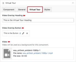
The tab to the right reads Virtual Tour, and this is where the video will be selected. The content manager will first add the heading overlay text, however, this field is not required. They will then add a link & text to the button that appears within the component. The last field is where the video will be selected from the media library.
Suite A-258

