Suite A-258
Quick Tips
- Always name the component based on the content it contains so that content managers can easily identify the contents of the component from the backend.
- Always check what the component will look like live on all devices using the Preview feature before publishing the update.
- This component is available on both Full Width and Two-Thirds Width content sections.
The Purpose of This Component
This component can be used to add blank space on a page for styling reasons. This component should be used if the content manager feels as though there needs to be space between components.
Below is an example of the Spacer Component, which has been set to 80 pixels
How to Use the Spacer Component
When a content manager selects a Spacer component from the component dropdown list, they will see three tabs within the component’s settings. The first tab reads Component, and this is where content managers will name their components internally on the backend. This setting is for organizational purposes, and this information will never be public to users on the front end.
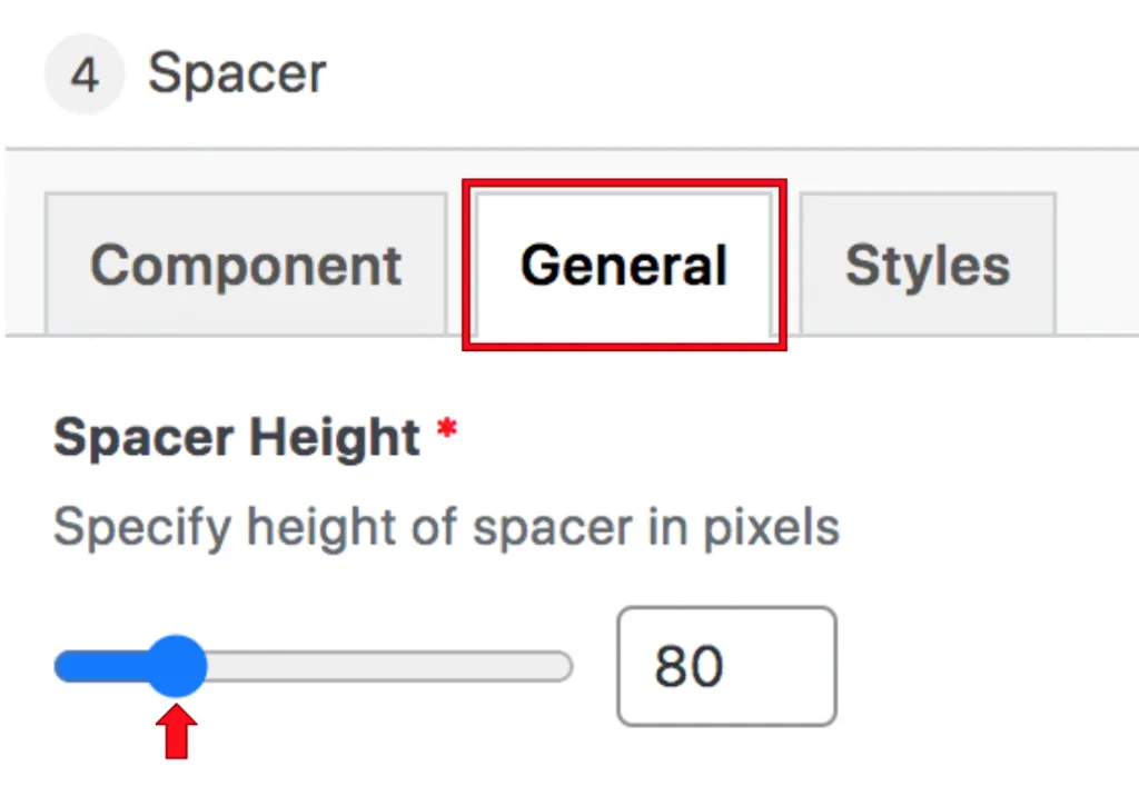
In the General section, content managers will see where they can adjust the height of the spacer in pixels. The scale of the spacer is between 0-400 pixels.

Content managers should always check the preview to see how many pixels they should choose for the spacer’s height.
Suite A-258

