Suite A-258
Quick Tips
- Always name the Hero Slider Component based on the content it contains so that content managers can easily identify the contents of the Hero Slider from the backend.
- This component is available on both the Full Width and Two-Thirds Width content sections.
- The highlighted text should entice the user to click on the call to action.
- The text will appear on the left-hand side of the image, so the focus of the image should not be on the left-hand side.
The Purpose of This Component
Hero Sliders are typically the first components users will see when they visit a page. With a large image and bold text, it’s designed to engage users visually and highlight the call to action.
This component is ideal for storytelling, allowing the user to click off into a full story. This component can be used to draw readers to particular stories or featured events happening at Worcester State University. The text within this component should be compelling, and noteworthy.

How to Update this Component
When a content manager selects a Hero Slider component from the component dropdown list, they will see three tabs within the component’s settings. The first tab reads Component, and this is where content managers will name their components internally on the backend. This setting is for organizational purposes, and this information will never be public to users on the front end.

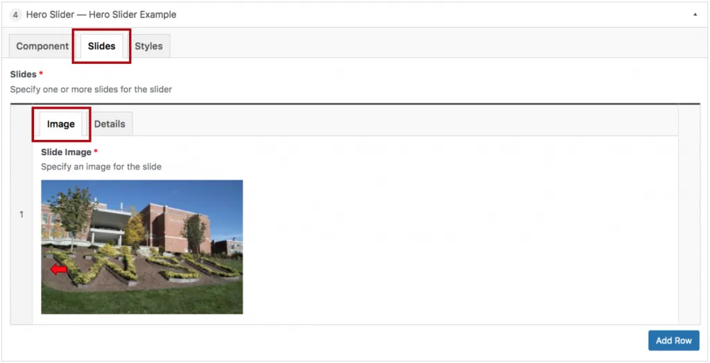
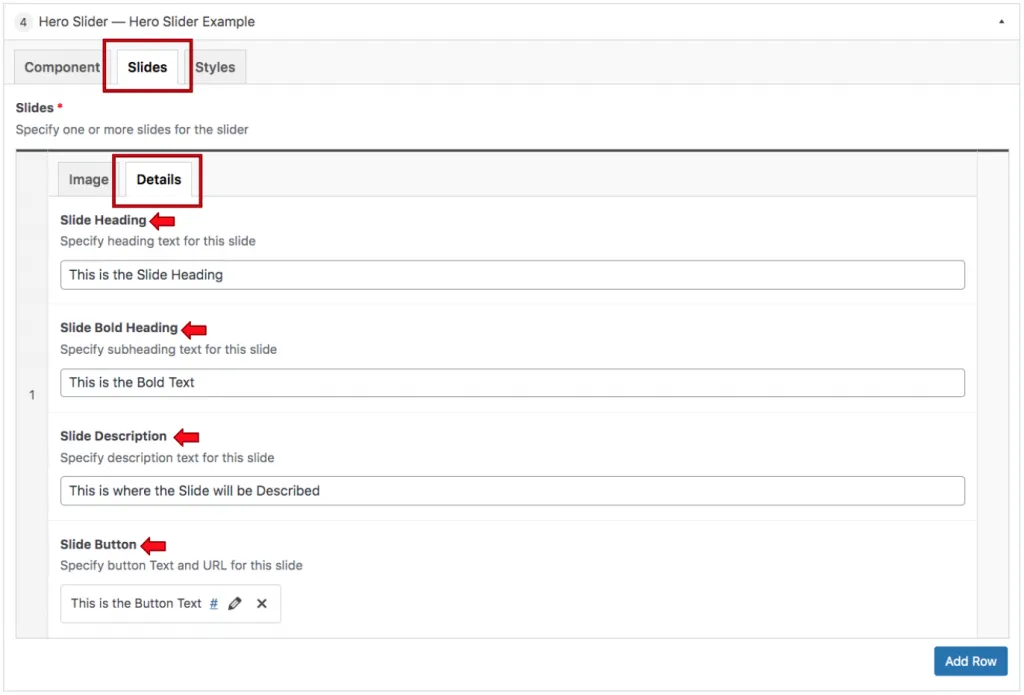
The Slides tab is where the content of this component is added. The content manager will first add the image that appears within the slider. The image selected should have the action of the image shown on the right-hand side. Since the text appears on the left side, the content manager doesn’t want the action of the image to be hidden by the text. The Details tab is where the textual content and the button are added.
The Slide Heading is the white text appearing in front of the colored outlying text, and the Slide Description is the paragraph text appearing within the component. This field should be filled with content that describes the text above it. Below is where the button is defined.

When the content manager inserts this component into the content section, they will automatically have two slides to populate by default. Additional slides can be added by clicking the Add Row button at the bottom of the component settings.
Suite A-258

