Featured Posts
Suite A-258
Quick Tips
- Always name your Featured Posts components based on the content they contain–that way, you’ll be able to easily identify them from the backend.
- Always check what the component will look like live on all devices using the Preview feature before publishing the update.
- This component is available on Full-Width content sections and Two-Thirds Width content sections.
- Even though this Component is titled Featured Posts, posts are not the only types of content that can be used within this component. Content managers can get creative with the content displayed using this component. For example, managers can have users link off to other internal pages within the site, external resources, PDFs/presentations, or events. The post title and Post image (or video) are the only required fields inside this component, so content managers have a lot of freedom with how they chose to populate this component.
- The minimum number of featured posts in this component is 2, and the maximum number of posts that can be added is 4.
The Purpose of This Component
Featured Posts components can be used to showcase published posts within a carousel throughout the website. Posts that are featured within this component should be relevant to the content of the page it was added to. This component is an effective storytelling vehicle because it allows for the user to view consecutive and relevant stories within a webpage.
The Featured Posts component should be used when posts need to be showcased within a page. The posts selected should be relevant to the existing content on the page and support the user’s intent.
This is an Example of a Featured Post
How to Use This Component
When a content manager selects a Featured Posts component from the component dropdown list, they will see four tabs within the component’s settings. The first tab reads Component, and this is where content managers will name their components internally on the backend. This setting is for organizational purposes, and this information will never be public to users on the front end.
The tab to the right of the Component tab is the General tab, where the content manager can specify a heading and description text for this component if they choose. This is also where the content manager will identify the size of the post title, whether it’s small or large, the vertical alignment of the Thumbnail, and set the custom Thumbnail Aspect Ratio.
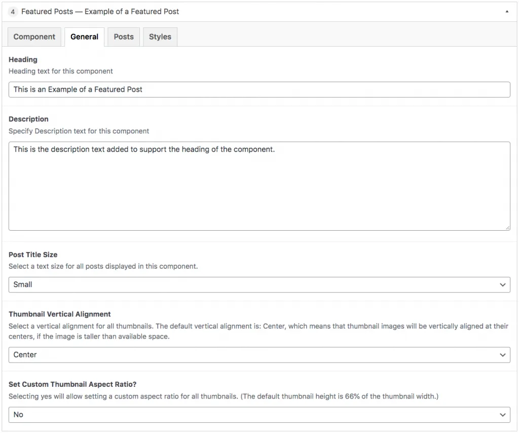
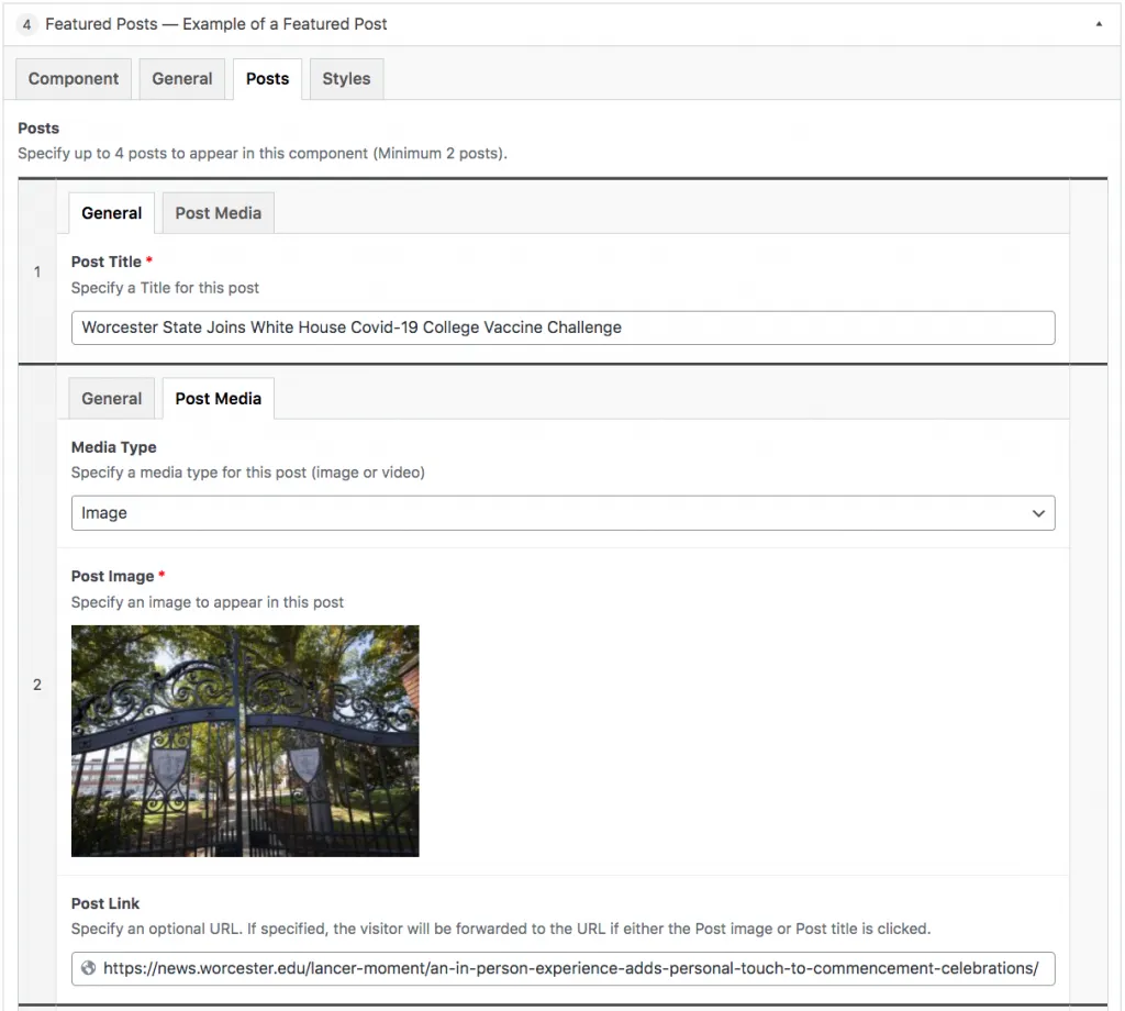
The Posts tab is where the post settings will be set, and the first thing content managers see when they click on that tab is the Media type they can select. They will be given the option to select either photos or videos, and the Post media settings below will change based on the media type selected. The final field is the Post Link section, where content managers will paste the link.
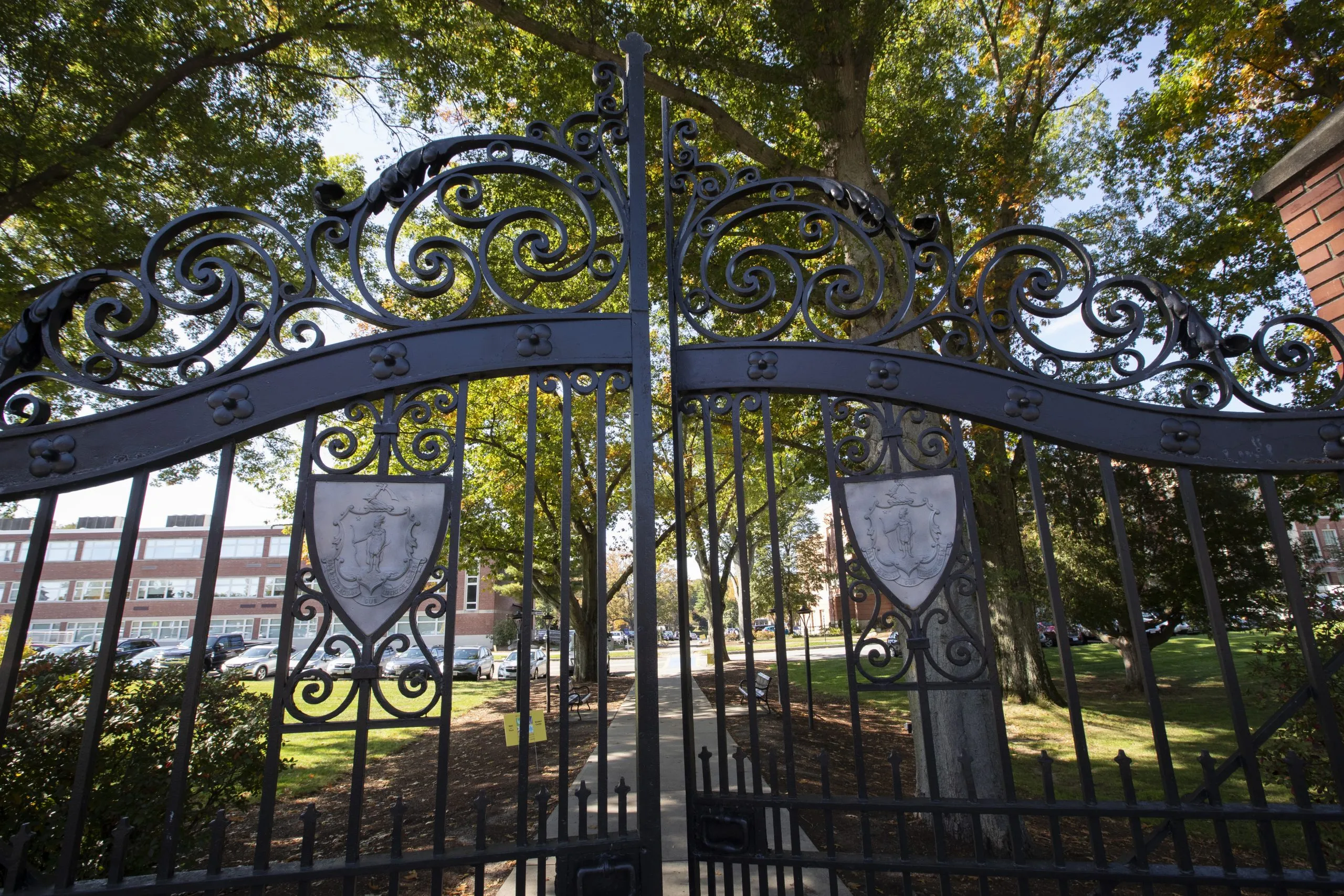
In the example below, there are two posts added to the component. The first post has the General settings tab open, where you can see the title is “Worcester State Joins White House Covid-19 College Vaccine Challenge”. The second post in the screenshot shows the post’s media settings, where the media setting is defined as an image, and the image of the Worcester State University gates has been selected.
Suite A-258


