Color Block Grid
Suite A-258
Quick Tips
- This component is available on both Full Width and Two-Thirds Width Section content sections.
- Try to keep Block Titles concise
- This component is designed to display three different blues that alternate in color as more blocks are listed. If two blocks are the same color and the titles are similar, try reordering one of the block items so that while the titles are similar, the blues are different so users know clicking these blocks will take them to 2 different links. For example, the Computer Science department page has a colored grid block component, and on it, there are two different blocks for Computer Science, one is a major and one is a minor. While the titles are similar, the colors of the grid block are different so the user automatically knows that these are two different grid blocks that are leading to different places on the website.
- If the block titles are more than two lines, the block height will appear taller as opposed to the block titles with one line of text. As a result, a row that contains a block title longer than one line will cause the rest of the blocks in the row to increase in height.
The Purpose of This Component
This component can be used to display links in a visually compelling way to show multiple of like-content. The content manager can group links together in the same component to help visualize like-content and group related links together in a visually compelling way.
How to Use the Color Block Grid Component
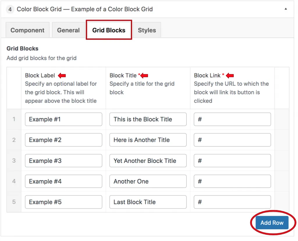
When a content manager selects a Color Grid Block component from the component dropdown list, they will see four tabs within the component’s settings. The first tab reads Component, and this is where content managers will name their components internally on the backend. This setting is for organizational purposes, and this information will never be public to users on the front end.
In the General section, content managers will see where they can add a heading or description text to this component. Neither of these fields is required, so content managers can leave these fields blank in the backend.

The next settings tab that content managers will fill out is the Grid Blocks tab. The first setting within this tab that content managers will need to fill out is the block labels. Block labels act as more than just a title–they are also an effective way to group and organize blocks. Content managers will specify the block label which will appear above the block title, this field is not required. Block labels are an effective way to group and organize blocks and act as more than just a title.

In addition to Block labels, content managers will also fill out Block titles, which is the larger text that appears within a block. Taking a look at the example Colored Grid Blocks above, the block title is the larger text, while the label is the smaller text. The block link field is where content managers will add the links that the blocks are leading to.
If a content manager wants to reorganize the order in which their Color Block Grids appear, all they need to do is drag and drop the grid block row to the desired order.
Suite A-258

