Callouts Bar
Suite A-258
Quick Tips
- Always name the Callouts Bar component based on the content it contains so that content managers can easily identify the contents of the Callouts Bar from the backend.
- Always check what the component will look like live on all devices using the Preview feature before publishing the update.
- This component is available on both Full Width and Two-Thirds Width Section content sections.
- Always avoid using the same icon twice in the same component.
The Purpose of This Component
This component is designed to call attention to a group of related links. Each link is accompanied by an icon that attracts attention. The icons should visually relate to the content of the page the link is linking to. For example, the alert icon should only be used in the case of an alert.
The heading text should draw attention to the group, and the description text should support this heading, further enticing the user to click through these groups of links. Below is an example of the Callout Bar component.
How to Use the Callouts Bar Component
When a content manager selects a Callouts Bar component from the component dropdown list, they will see four tabs within the component’s settings. The first tab reads Component, and this is where content managers will name their components internally on the backend. This setting is for organizational purposes, and this information will never be public to users on the front end.
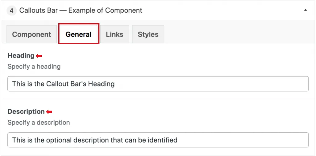
The General tab is where content managers can add a heading or description text to this component. Neither of these fields is required, so content managers can leave these fields blank in the backend.

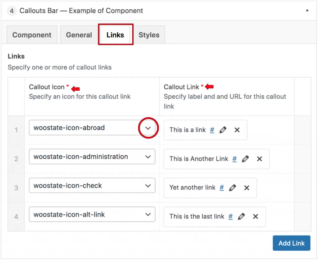
The Links tab is where the content manager will select the Callout Icon that will appear above the link text, the link text, and the link itself.

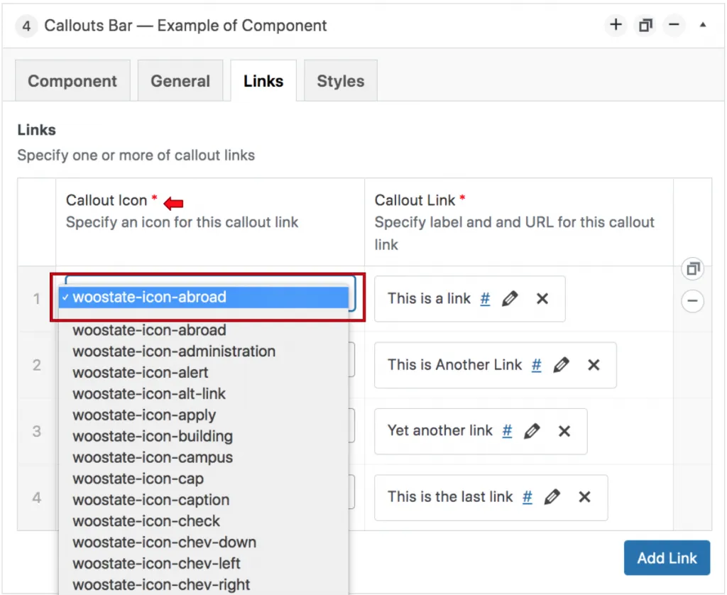
When selecting a callout icon, the content manager will see that there is a list of icons to choose from. Each icon is labeled “woostate-icon” followed by a descriptive word that describes the icon. Each icon should only be used once per component.

Links and icons can be deleted by clicking the minus (-) symbol to the right of the row. The links and icons can be reordered by dragging and dropping the rows to their desired location.
Suite A-258

