Suite A-258
Quick Tips
- Always name your Accordions components based on the content they contain–that way, you’ll be able to more easily identify them from the backend.
- This component is available on Full-Width content sections and Two-Thirds Width content sections.
- The Item Title is the text that appears on the accordion itself. The Item Title is clicked to reveal more content within the Accordion.
- The Plain Text content type only allows for regular paragraph text to be added to the Accordion. If the content manager desires to show text with any additional functionalities they should select a WYSIWYG, which operates similarly to a Word Document or Google Doc.
The Purpose of This Component
Accordions can be used to display top-level keywords or keyphrases to grab the page user’s attention. The accompanying content is hidden from view unless the user clicks on the Accordion to open it up.
The Accordions component can be used in instances where like-content needs to be displayed. It can also be used in situations where content managers need to hide a large amount of text behind an Accordion in an effort to shorten a long page.
An Example of The Accordion Component
-
WYSIWYG Content Type
This is an example of an Accordion with a WYSIWYG content type.
WYSIWYGs operate very similarly to Word documents. The content manager can use this content type to add the following elements to their Accordions:
- Headings
- Bullet listings
- Links & buttons
- Images, videos, PDFs, and other media
To learn more about WYSIWYGs and its functionalities on the Worcester State Website, click on the button below
- This is an example of an Accordion with a Plain Text content type. As you can see, the content manager is limited to plain textual content. The only text type that will display within this content type is paragraph text. If the content manager wants to add any additional functionalities to the text, they will need to select a WYSIWYG content type.
How to Use the Accordion Component
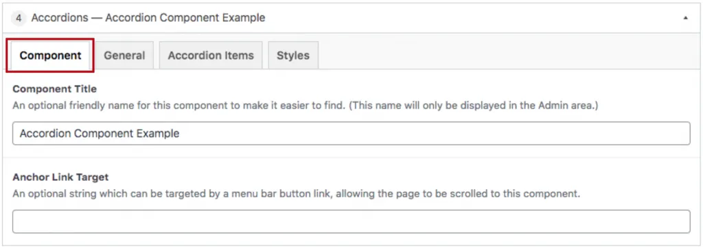
When a content manager selects an Accordion component from the component dropdown list, they will see four tabs within the component’s settings. The first tab reads Component, and this is where content managers will name their components internally on the backend. This setting is for organizational purposes, and this information will never be public to users on the front end.

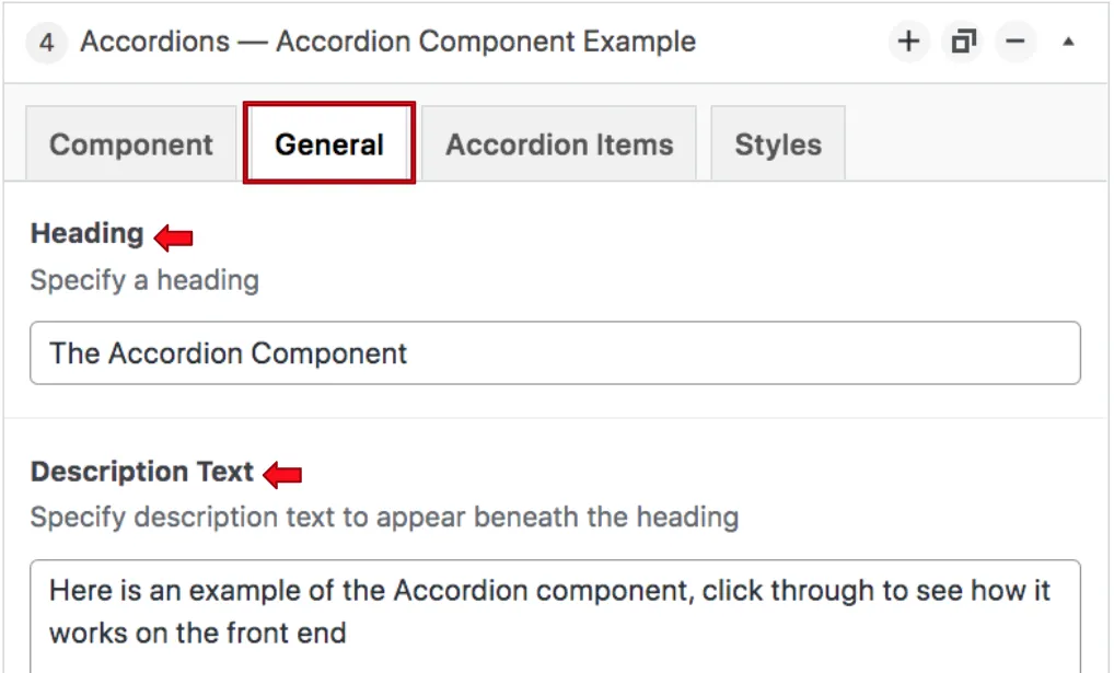
The tab to the right of the Component tab is the General tab, where the content manager can specify a heading or description text for this component if they choose. The red arrows below show where the heading and description text fields are. This tab does not have any required fields, meaning that the content manager can leave it blank if they choose or if it makes sense in terms of content.

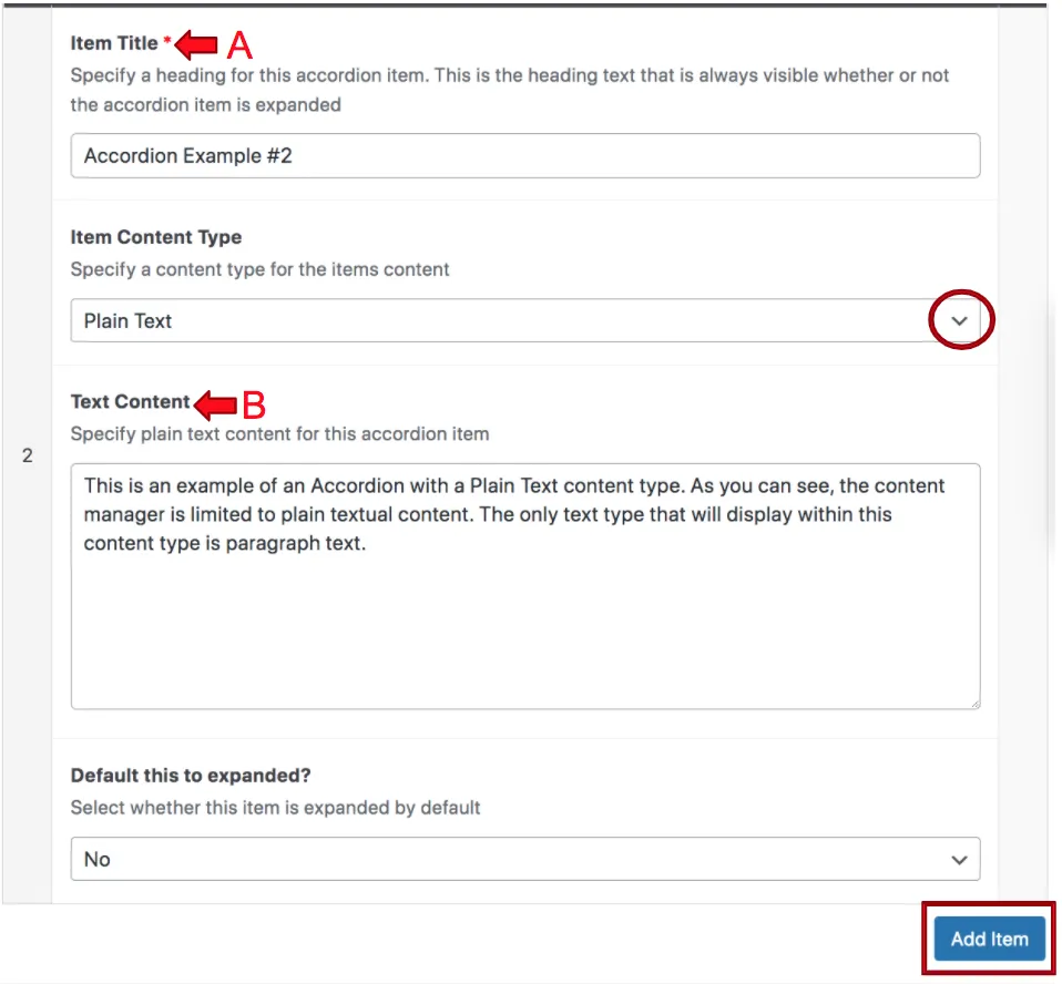
The next tab is the Accordion Items tab. Here the content manager chooses the title they want to be the title of their Accordion, this is labeled “A” below with a red arrow. The red circle is where the content manager will select the Accordion’s content type, either plain text or a WYSIWYG.
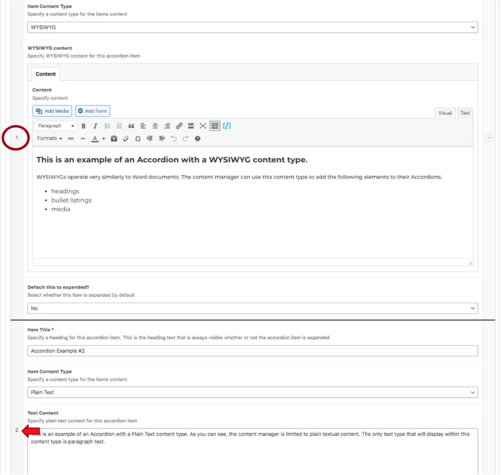
The Red arrow in the screenshot below labeled “B” is where the content type is displayed within the component settings. In this first example, the content type selected is a WYSIWYG. These content types function a lot like Word Documents and have a lot of the same functionalities. To learn more about WYSIWYGs, check out the WYSIWYG page of the CMS guide. If a content manager wants to style their text in any way, they should select the WYSIWYG content type from the dropdown that has a red circle in the example.

WYSIWYG’s are not the only content types content managers can select. Plain Text can be selected if content managers have textual content that they want to display without any styling.
The last dropdown below the content type allows content managers to choose whether this particular accordion is already open when a user visits the page. Advantages to this practice are that content is not hidden behind an Accordion, making it automatically visible and available to users. Keeping this defaulted to “no” gives the users the opportunity to choose if they want to engage with this content.
The red rectangle at the bottom of the screenshot above is the button that content managers will click if they want to add another Accordion to this component.
Content managers are not limited to one content type within a set of Accordions. Two Accordion items can be added, one a WYSIWYG content type and one a Plain Text content type. The content-type selected will be dependent on the content going within the Accordion.

Content managers can reorder accordion items within the component by hovering over the numbered grey column and dragging and dropping the accordion items to the desired order within the list. The numbered grey list is shown above in the red circle and red arrow. As the manager reorders the Accordion items, the numbers will automatically adjust to account for the new order.
Suite A-258

