Suite A-258
-
- Quick Tips
- The Purpose of this Component
- Example of the WYSIWYG Component
- How to Use the WYSIWYG Component
- Video
- Quick Links
Quick Tips
- WYSIWYG stands for What You See Is What You Get.
- Always name the WYSIWYG Section based on the content it contains so that content managers can easily identify the contents of the WYSIWYG from the backend.
- Always check what the component will look like live on all devices using the Preview feature before publishing the update.
- This component is available on both Full Width and Two-Thirds Width content sections.
The Purpose of This Component
This component was designed to display content–both text and images–in visually compelling ways that align with brand identity & institutional culture.
An Example of the WYSIWYG
Content managers will find that WYSIWYGs function similarly to Word Documents. In addtion to paragraph text, there is also heading text available, with headings ranging from H1-H6s. The text you are reading now is paragraph text, this is the default text size on the website. Below are examples of what each heading type looks like within a WYSIWYG.
This is Heading 1
And this is Heading 2
You Guessed it, This is Heading 3
This is Heading 4
And this is Heading 5
This is Heading 6
How to Update this Component
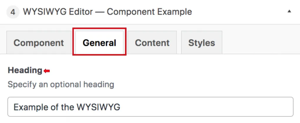
When a content manager selects a WYSIWYG component from the component dropdown list, they will see four tabs within the component’s settings. The first tab reads Component, and this is where content managers will name their components internally on the backend. This setting is for organizational purposes, and this information will never be public to users on the front end.

The next tab continent managers will see is the General tab, and this is where content managers will specify a heading for this component. This field is required, so adding a heading is necessary.

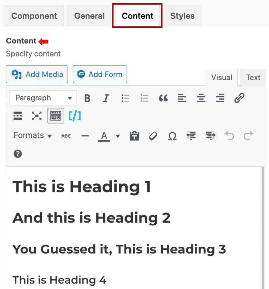
The next tab is the Content tab, and this is where the WYSIWYG’s content is specified. This content section works a lot like a word document, with multiple icons running across the top to allow for different functionalities.
- The Add Media button is the first option. Clicking this opens the media library where content managers can add images to the section, much like one would in a Word doc. By clicking the image, you will be able to edit or delete it.
When they click on the image, they will see a field appear where they can change the alignment of the image, or edit it. They can also remove the image by clicking the X. - The Paragraph & Heading settings are the next option. Here, content managers can change the size and type of the text.
- The two icons to the right of this dropdown are where the content manager can select to bold or italicize the text.
- The two icons to the right of those allow the content manager to either add bullets to list items or add numbers to list items in a numerical way.
- The content manager will then see a quotation mark, where they can formulate text in a blockquote format. The quotation mark button allows content managers to formulate text in a Blockquote (bold, and explain what this is ) format.
- The icon to the right of that is where content managers can add links to text.
- The icon to the right of this inserts a Read More tag. The icon on the right of that opens the editing screen into a full screen. Clicking on the same button also decreases the editing screen to the original size. The next icon opens the toolbar even further to expand more word-like. functionalities, such as editing text color, line indentations, and undo & redo.
- The Formats dropdown is where content managers can add buttons and bold their text in their WYSIWYGs.
- The following icon allows content managers to add a strikethrough to their text, and the icon to the right of it allows them to add a horizontal line.
- The next dropdown allows content managers the ability to change the color of their text.
- The following icon allows content managers to paste as text. When copying and pasting text either from the existing website or a document such as Google Docs or Word, content managers should always select “Paste and Match Style” when they right click to paste. This ensures that code from the old website or Google Doc is not copied over in addition to the text. If a content manager selects “Paste”, then the old code will get copied over and overwrite the new code on the website which will cause styling issues. If a content manager suspects that they might have clicked “Paste” accidentally, they can select the text in question and click the eraser button to the right of the paste as text icon, which will clear the formatting of the selected text, thusly removing any accidentally copied code from the text’s source.
- If a content manager needs to add a symbol to their WYSIWYG, they can select if from the symbols menu which is the icon to the right of the eraser.
- The following icons allow the content manager to indent their text, either to the left or the right.
- The final icons allow the content manager to undo and redo content edits within the WYSIWYG component.
Suite A-258

