Suite A-258
Quick Tips
- Always name the Tabs Section based on the content it contains so that content managers can easily identify the contents of the Tabs from the backend.
- Always check what the component will look like live on all devices using the Preview feature before publishing the update
- This component is available on the Full-Width content section.
The Purpose of This Component
The Tabs Component can be used to house groups of like content and display them in visually engaging ways. The user gets to click through tabs of content and explore the information available.
This component should be used if there are groups of like content that are related enough to be grouped together. Below is an example of the Tab Component.
How to Update this Component
When a content manager adds the tab component to a full-width section, they will see the following tabs, Component, General, Tabs, and Styles. These tabs control the content of this component.
The Component tab is where the content manager should name their tab component. Components should be named based on the content it contains. After assigning the section name, the content manager will then click the General tab where they can assign a heading for the component and the description text that will accompany it. For example, if you are creating a Tabs Component to house research from your department’s 2 different centers, you could name the component ‘Center Research’.
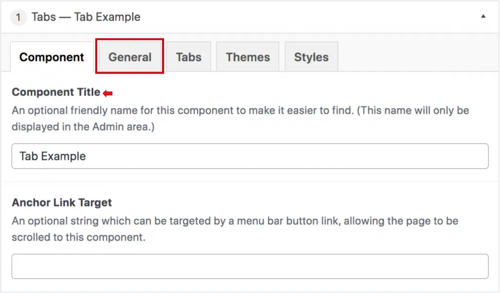
As its name implies, the unique feature of this component is that it acts as a folder organizer, with tabs that are always visible which houses content that becomes visible when the tab is clicked. In the Tabs section, you can enter the title of each tab. Following the above example for Center Research, tabs could be titled ‘Urban Action Institute’ and ‘CityLab’, if this component was for Urban Studies. The tab title will automatically capitalize. Content managers can add 1-4 tabs within this component.
The next section has to do with the content within the tab, which becomes visible to users upon clicking the respective tab title. There are 5 different content types you can use within a given tab–every tab can house uniquely-displayed content, if need be. These content types are listed below, along with detailed instructions on how to update these content types.
-
WYSIWYGSs allow content managers to add images, video, and formatted text. Read more about WYSIWYGs here.
WYSIWYGs are common components that content managers will find on the backend of the Worcester State website. These components work and function very closely with word documents. When the content manager selects the WYSIWYG content type, they will see two tabs that read General and Content. The general tab is where the content manager can add a heading to this tab. This is not a required field, and the content manager can leave this blank.
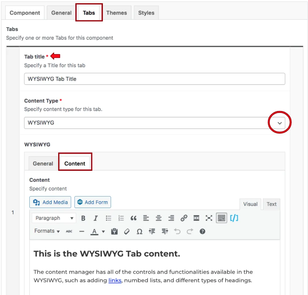
Clicking on the Content tab will open up the WYSIWYG where the content of the tab can be added. Content managers should reference the WYSIWYG page of this training guide for information about this content type, how to use it, and best practices.
-
Featured Post content allows you to pair a collection of images (1-4) with respective text titles, with the option to link to another page by clicking each image. Read more about Featured Posts here.
When a content manager selects the featured posts content type from the dropdown menu, they will see some different settings than they saw in the WYSIWYG. This is because this content type allows for featured posts to be listed within a tab.
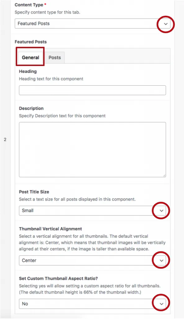
When the General tab is selected, they will see a heading and description field where they can add an optional heading or description for this section. The next field is titled post title size, and this is where they will select either small or large title sizes. The fields are below are related to the post’s featured thumbnail alignment settings and aspect ratio settings. The content manager will find that they can select either top, bottom, or center alignment as well as select whether or not the image will have a custom thumbnail aspect ratio.
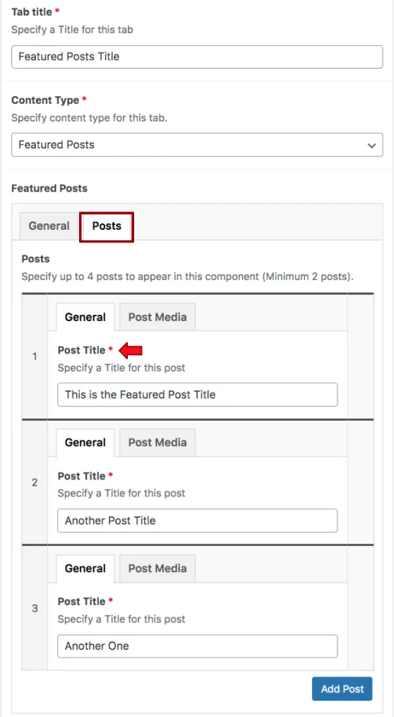
When the content manager finished setting up the General settings, they will then click on the Posts tab, where they will see two more additional tabs appearing, titled general and post media. The General tab is where the title of the post is listed. To the left of each post title, there is a number, this tells the content manager which post they are editing within the tab.
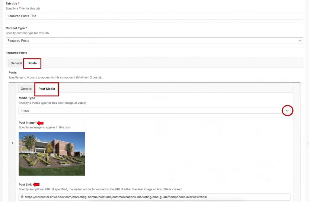
The Post Media tab is where the media type is specified, content managers can either use an image or a video as the post media type. The field below is where the image will be selected from the media library or the content manager’s computer. The post link is where the link to that specific post should be added.
By default, the component will automatically load up two posts for the content manager to populate, but more can be added by clicking the Add Post button at the bottom of this tab. Posts can be recorded by clicking on the post number mentioned above and dragging and dropping the post to the desired order.
-
Grid Columns allow for equal spacing between content, whether than be image or text. Grid Columns are most often used to show an organized, gridded collection of logos. Read more about Grid Columns here.
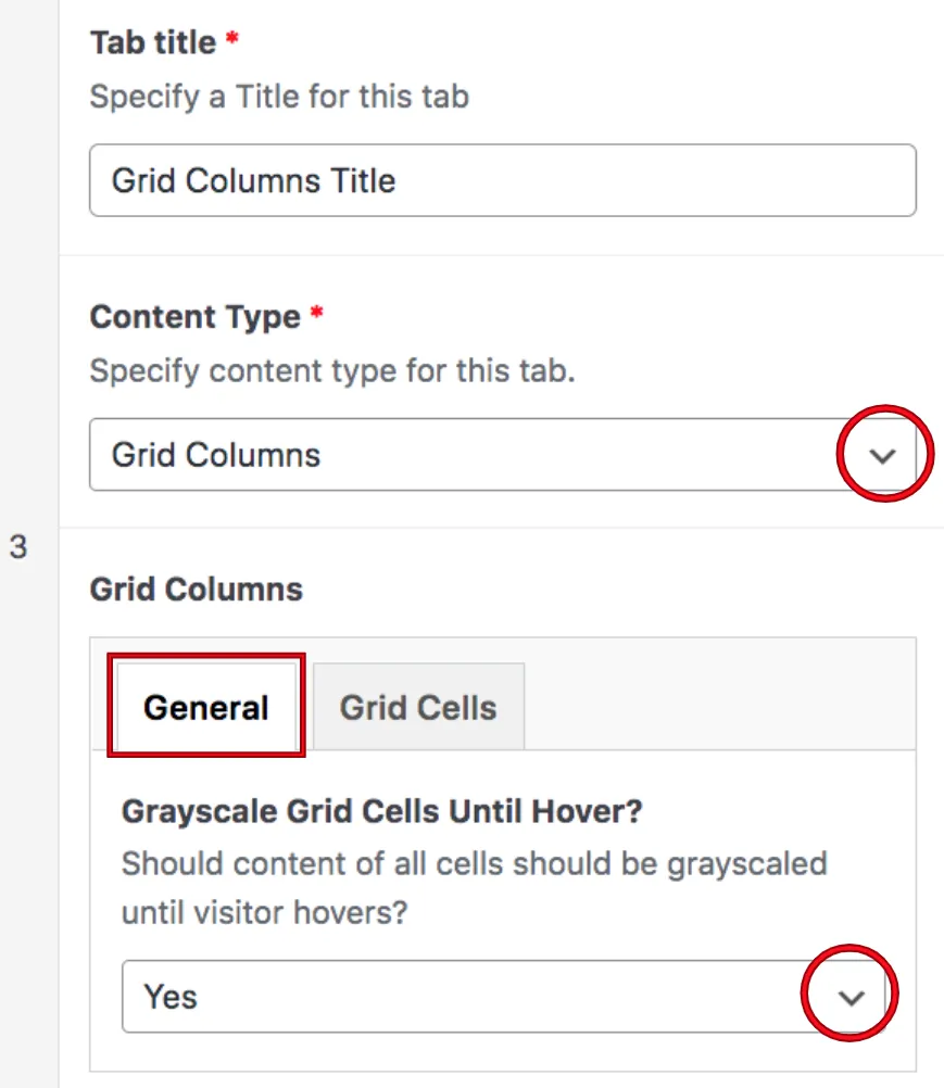
When the content manager selects the grid column content type, they will see two tabs appear that read General and Grid Cells. The General tab contains a dropdown menu that allows the content manager to show the images listed within the tab with a greyscale effect until the user hovers over it. Once the user hovers over the image with their cursor, the image will automatically become colorized. This allows for interactive engagement with the content within this tab.
Clicking on the Grid Cells tab opens up additional settings for this content type within the tab component. First, the content manager can select the vertical alignment for the grid cell. They can either click top, middle or bottom. Generally speaking, the vertical alignment should be consistent for each cell.
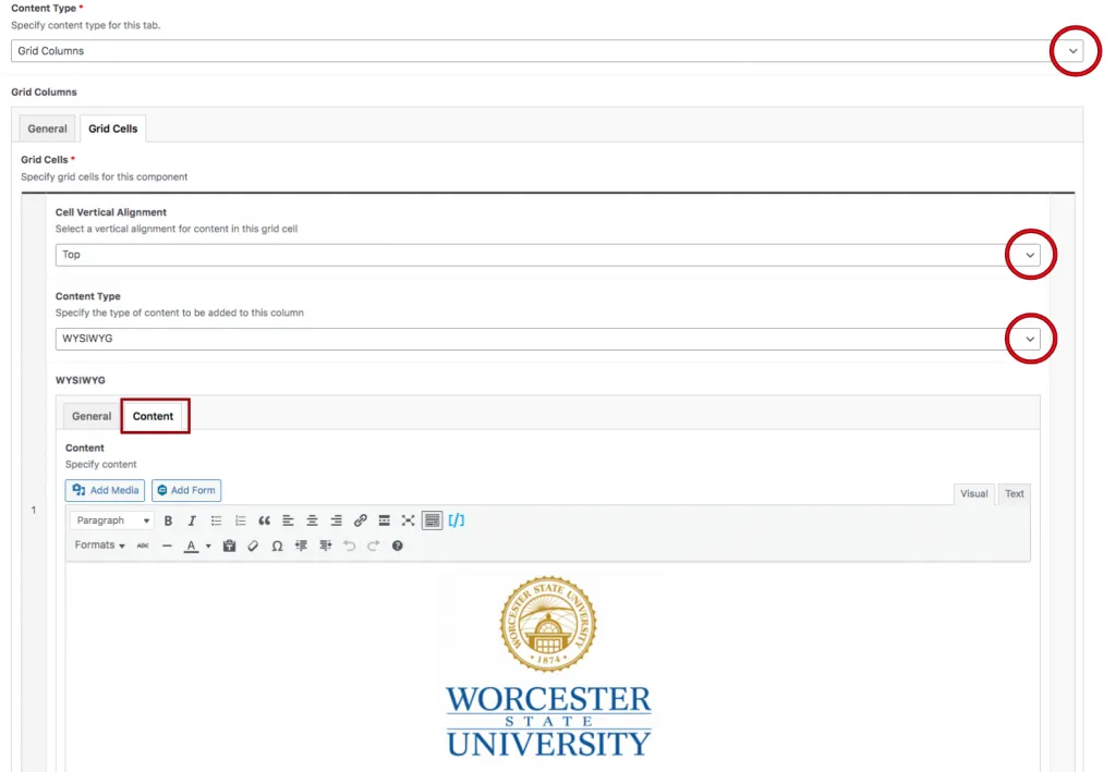
This is where the image will be selected from the media library. Text can accompany this image, but it is crucial that all of the accompanying text is consistent and does not take away from the effectiveness of the image.
As a best practice, if content managers are adding logos to this content type, each logo added should live within its own Grid cell. This means that content managers will add logos or images cell by cell, never adding more than one logo per cell. As cells are added to the tab, they will appear from left to right, with 4 grid cells across the top of the tab. Cells can be reorganized by clicking on that cell’s corresponding number and dragging it to the desired location.
-
Related Links can be used to display a collection of titles, items, etc. that links to another page. To read more about Related Links, click here.
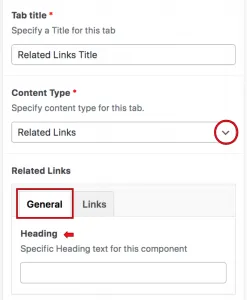
When the content manager selects the Related Links from the Content Type dropdown, they will see two tabs appear reading General and Links. The content manager will use the General tab to assign a heading, this is not a required field.
The next tab is the Links tab, and this is where content managers will assign the related links that appear within this tab. When they click on the select link button, a window will appear where they can insert and edit the link. The link’s URL should be added to the URL field, and the accompanying link text should be added to the link text field. Content managers can also search for existing content using the search field.
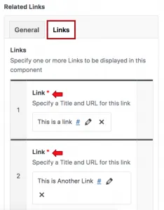
Once a related link has been added, the content manager can add more by clicking the add link button at the bottom of the component. The related links can be recorded when content managers click on the number in the grey column to the left of the link and drag and drop the row to reorder.
-
Accordions display a title or an otherwise small amount of content while housing a larger amount of content that drops down and becomes visible when clicked. To read more about Accordions, click here.
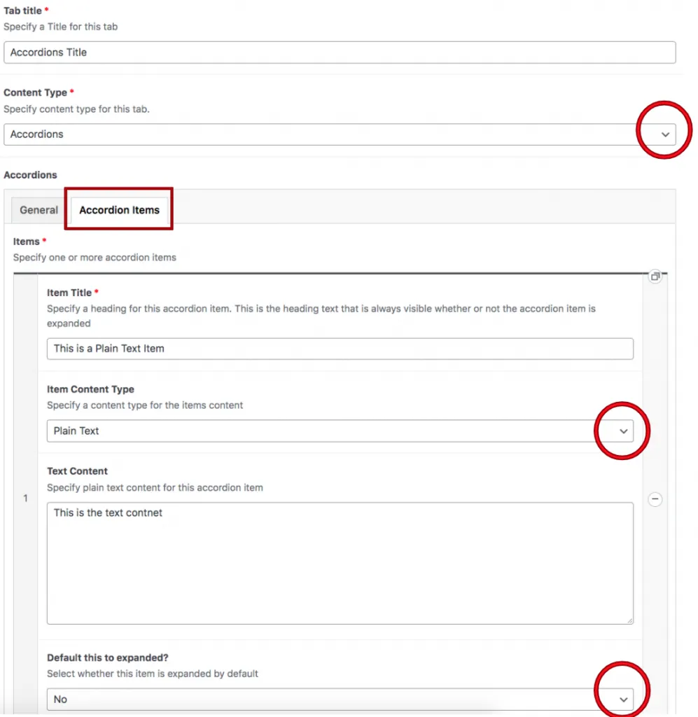
When a content manager selects Accordions from the Content-Type dropdown, they will see two tabs appear below, titled General and Accordion Items. the General tab is where the content manager will specify a heading for this accordion item. Content managers should keep in mind that this heading is not the heading appearing on the Accordion itself, but the heading that appears above the tab button. The Yes or No dropdown at the bottom controls whether multiple items can be expanded at once.
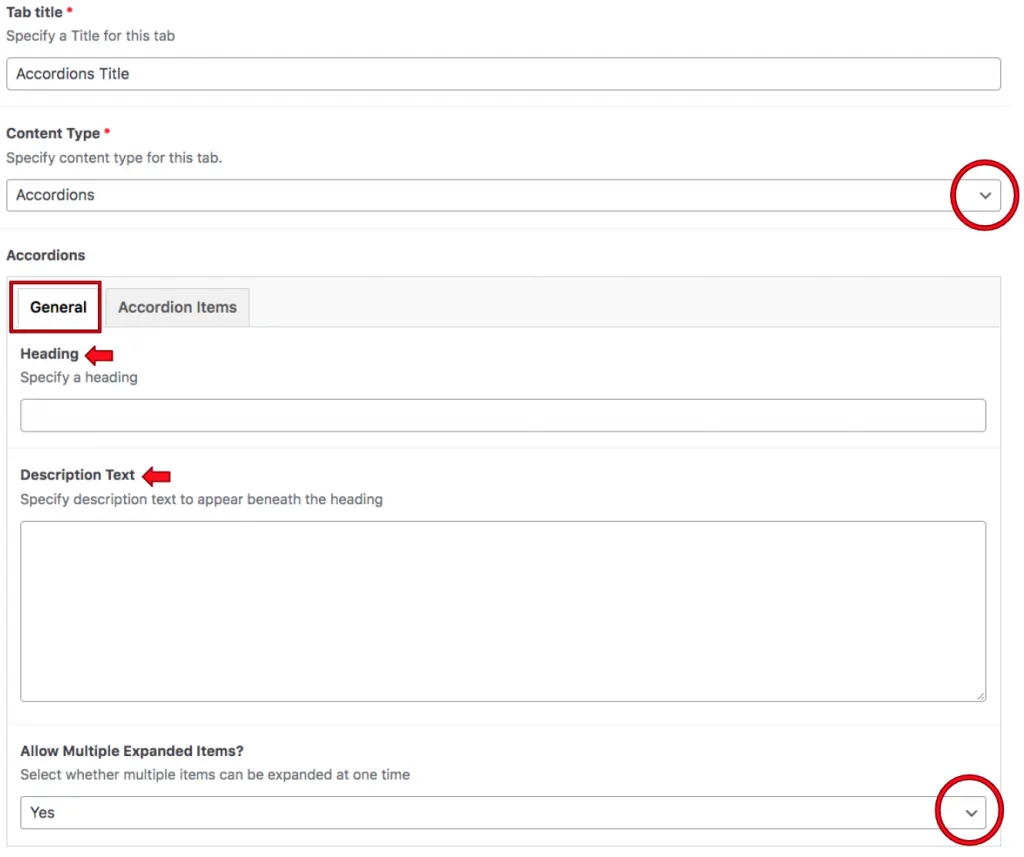
After configuring the Accordion content type’s general settings, the content manager will see where they need to add a required title to the Accordion. This is the text that appears on the accordion, which is then opened by the user to display the Content.
The Item content type allows the content manager to select whether this Accordion content type will be a WYSIWYG or plain text.
Example of Tab Component
This is the WYSIWYG Tab content.
The content manager has all of the controls and functionalities available in the WYSIWYG, such as adding links, numbed lists, and different types of headings.

- This is the text contnet
-
Here is the WYSIWIG content
As you can see, there there is more functionality available
Suite A-258


