Photo Gallery
Suite A-258
Quick Tips
- Always name the Photo Gallery component based on the content it contains so that content managers can easily identify the contents of the Photo Gallery from the backend.
- This component is available on both Full Width and Two-Thirds Width content sections.
- Uploaded images will default to the same size
- Please refer to the Web Culture Guide for guidance on photo regulation at Worcester State University.
The Purpose of This Component
The Photo Gallery component allows photos to be featured on the page in a visually engaging way. Users can scroll horizontally through the images within the component.
The Photo Gallery component can be used in a variety of ways. For example, a page dedicated to sharing recent move-in day experiences can host a Photo Gallery that displays similar images from a particular day or event.



How to Update this Component
When a content manager selects a Photo Gallery component from the component dropdown list, they will see four tabs within the component’s settings. The first tab reads Component, and this is where content managers will name their components internally on the backend. This setting is for organizational purposes, and this information will never be public to users on the front end.
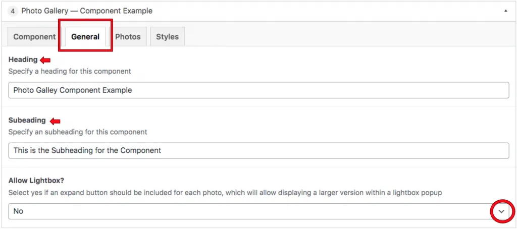
The General tab is where the content manager will add an optional heading and or descriptive text. This is also where they can set whether the component will allow Lightbox.
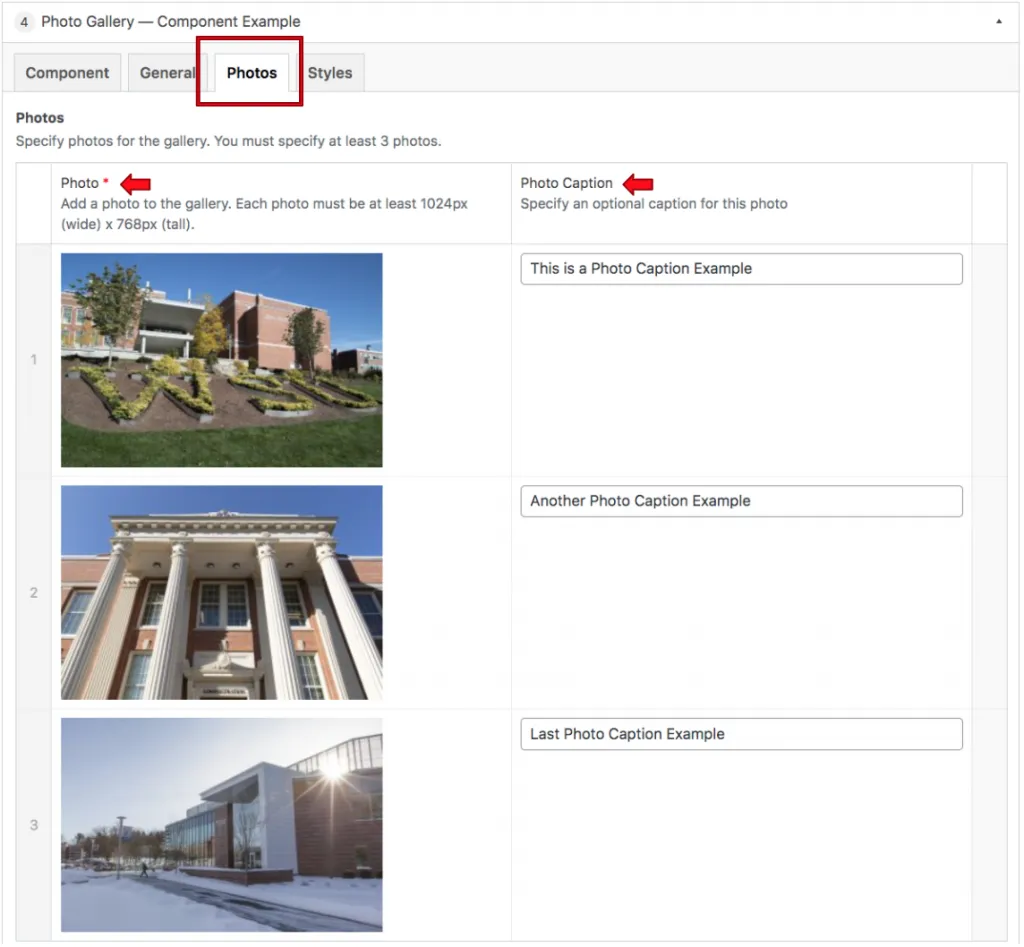
The Photos tab is where the photos that make up this gallery are selected. By default, the content manager will see 3 photo slots available to populate. More can be added by clicking on the Add Photo button.
Suite A-258

