List with Info Box
Suite A-258
Quick Tips
- Always name the List with Info Box Component based on the content it contains so that you can easily identify the contents of the List with Info Box from the backend.
- This component is available on both Full Width and Two-Thirds Width content sections.
- Content managers should not add an image to the Info Box if there are already multiple lines of description text.
- Ideally, each icon should only be used once within a component. If the content you’re using does not allow for diverse icon usage (i.e. it’s a list of like items), then select the option to not use icons.
- The button text will automatically capitalize when the component is viewed on the front end of the page.
- When adding to an existing List with Info Box, make sure to keep the new info box content consistent with the existing content.
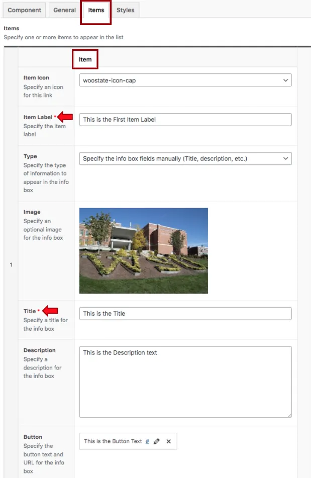
- The Item Label is the text that appears in the List, and the Info Box Title is the text that appears in the infobox on the right
The Purpose of This Component
This component is designed to display a large amount of information that can be sorted into a list without making the page too text-heavy. Descriptor content for each item is housed in a hidden pop-out box, which users can click to expand. As a result, users can take control of what they see and read throughout their experience on the page.
The World Languages department page uses a List with Info Box to highlight the student experiences within that department. As prospective students click through the list, the info box to the right updates to display the content relevant to that list item. If a particular list item catches the user’s attention, they have the choice to engage with it further.
How to Update this Component
When content managers add this component to a content section, they will see four tabs across the top. The Component tab is where content managers will name their components internally on the backend. This setting is for organizational purposes, and this information will never be public to users on the front end.
The next tab the content manager will see is the General tab, and this is where they can add their heading to the component. Content managers also have the option to add a subheading to this component in the field below. The next field is where they will be able to allow the icons to appear within this component. This is a dropdown field that has the option yes and no.
The next tab is labeled Items, and this is where the content manager will add the items and their labels. By default, the item tab will be open, and the content managers will see where they can select their icon from the dropdown list, and the item’s label.

The first setting they will see is the Type, where they can choose to either manually enter the content in the fields below or dynamically pull in the content from an existing published post. The settings below are only available if the type selected is manual entry.
Suite A-258


