Suite A-258
Quick Tips
- Always name the Grid Blocks Component based on the content it contains so that content managers can easily identify the contents of the Grid Blocks from the backend.
- This component is available on both Full Width and Two-Thirds Width content sections.
- Content managers are not responsible for the alternating of the text and media content within this component. The blocks alternate automatically.
- While there is description text that content managers can add, it is recommended that they keep this text brief, and between one and two sentences.
- The block labels will automatically capitalize on the front end.
The Purpose of This Component
This component can bring attention to, describe, or qualify a featured image or video. As Grid Blocks are added, they stack on the page alternating between image first and text first, creating a seamless user experience.
This component is versatile and can be used all throughout the website. The purpose of the component is to have the user click off to another internal page within the website.
How to Update this Component
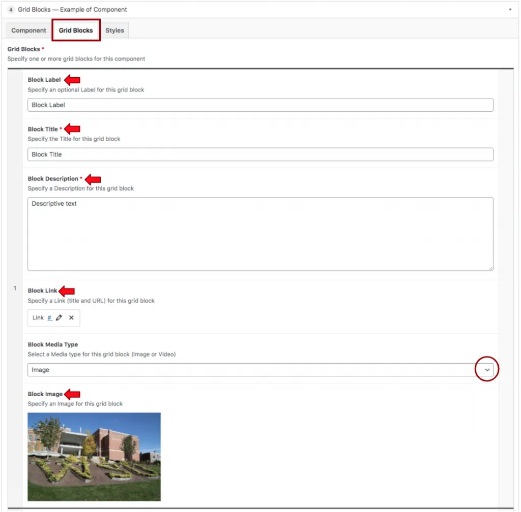
When a content manager selects a Grid Block component from the component dropdown list, they will see three tabs within the component’s settings. The first tab reads Component, and this is where content managers will name their components internally on the backend. This setting is for organizational purposes, and this information will never be public to users on the front end.
The Grid Blocks tab is where the content manager will define the following grid block settings; Block Label, Block Title, Block Description, and Block Link are show below with red arrows pointing at them. The Block Media Type will be selected from the dropdown menu inside the red circle. The content manager will be able to choose from a video or an image for this type of block media. After the type is selected, the user can select which media file to add from the media library.

The Block Label is the small capitalized text that appears first, it is followed by the Block Title. Content managers will find that they do not need to capitalize the text in the back end, the site automatically capitalizes the label text. The Block Title is beneath the Block Label, and this is a large heading. This text is not automatically capitalized.
The small text that follows the title is the Block Description, where text is added to further describe or add context to the title and label.
The Block Media type is where content managers can select whether the accompanying media will be an image or a video. Once the media is selected, the content manager will be able to select the video or image they want to use in this component.
Suite A-258


