Card Carousel
Suite A-258
Quick Tips
- Always name your Card Carousel components based on the content they contain–that way, you’ll be able to easily identify them from the backend.
- Always check what the component will look like live on all devices using the Preview feature before publishing the update.
- This component is available on both the Full-Width content sections and Two-Thirds Width content sections.
The Purpose of This Component
This component is designed to showcase information in a visually engaging way by the means of a sliding carousel that displays cards populated with content. The information shown in this carousel should be related and relevant to the content on the webpage.
These cards can display different information depending on the page it is added to. For example, the Card Carousel can be used to showcase specific courses relevant to a major or program. It can also be used to display news stories to add a visual storytelling aspect to the webpage.
This is the Card Carousel Component -
-
-
-
How to Use This Component
When a content manager selects a Card Carousel component from the component dropdown list, they will see four tabs within the component’s settings. The first tab reads Component, and this is where content managers will name their components internally on the backend. This setting is for organizational purposes, and this information will never be public to users on the front end.
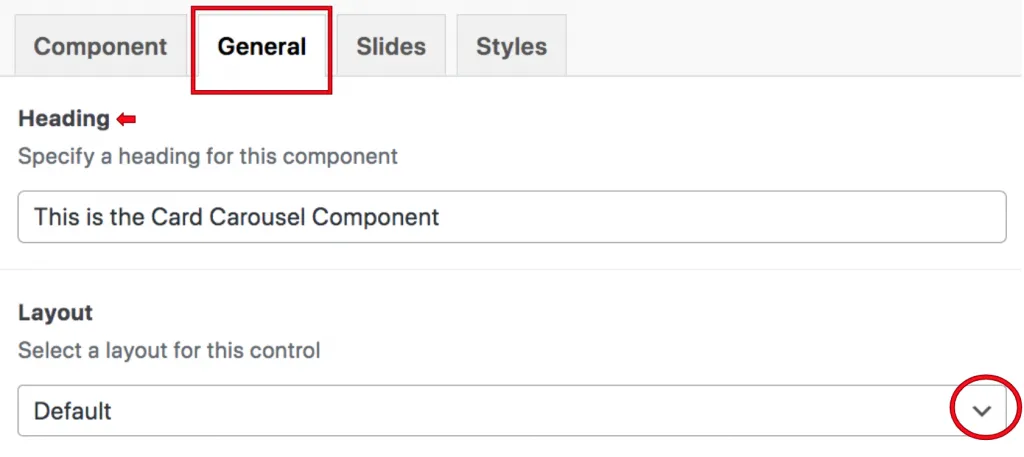
The tab to the right of the Component tab is the General tab, where the content manager can specify a heading for this component and choose the layout of the component. Content managers can choose between the Default, the courses or the facts layout.

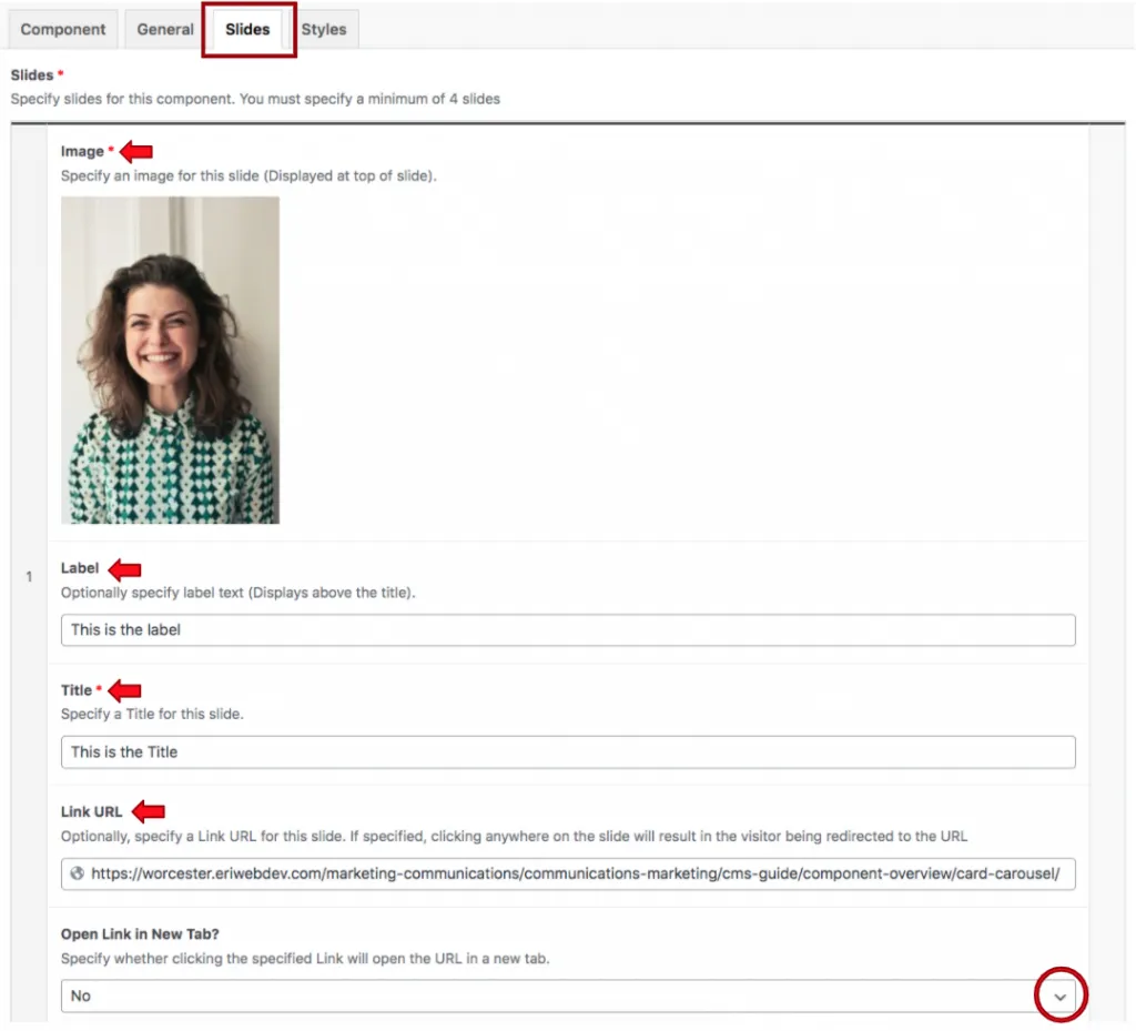
The next tab that the content managers will see is the slides tab, and this is where they will add the content of the Card Carousel. When they click on this tab, they will find that four tabs are added by default.

The first field they will populate is the image, which will appear at the top of the Card Carousel component. They will then add a label, which will appear capitalized automatically on the front end. The next field is the title, followed by field where users can add a link.
Suite A-258


