Action Bar Callout
Suite A-258
Quick Tips
- Always name your Action Bar Callout components based on the content they contain–that way, you’ll be able to more easily identify them from the backend.
- This component is available on Full Width and Two-Thirds Width content sections.
- This component should be used to display a Call to Action, or a verb-based statement that encourages users to perform singular action.
The Purpose of This Component
This component can be used to display a “Call to Action” (a verb-based statement that brings viewers in) and a button, with the goal of encouraging users to click the button and proceed to subsequent pages or next steps. The more precise the call to action and button is, the more likely a user will click it. It is the main goal that a content manager wants the user to perform on the page.
For example, this button text could read “Plan Your Visit” which links to another page on the website where users can take action, such as registering to visit the campus, or scheduling a tour.
An example of the Action Bar Callout Component
Double your Skillset, Expand your Opportunities!
How to Use the Action Bar Callout Component
When a content manager selects an Action Bar Callout component from the component dropdown list, they will see five tabs within the component’s settings. The first tab reads Component, and this is where content managers will name their components internally on the backend. This setting is for organizational purposes, and this information will never be public to users on the front end.
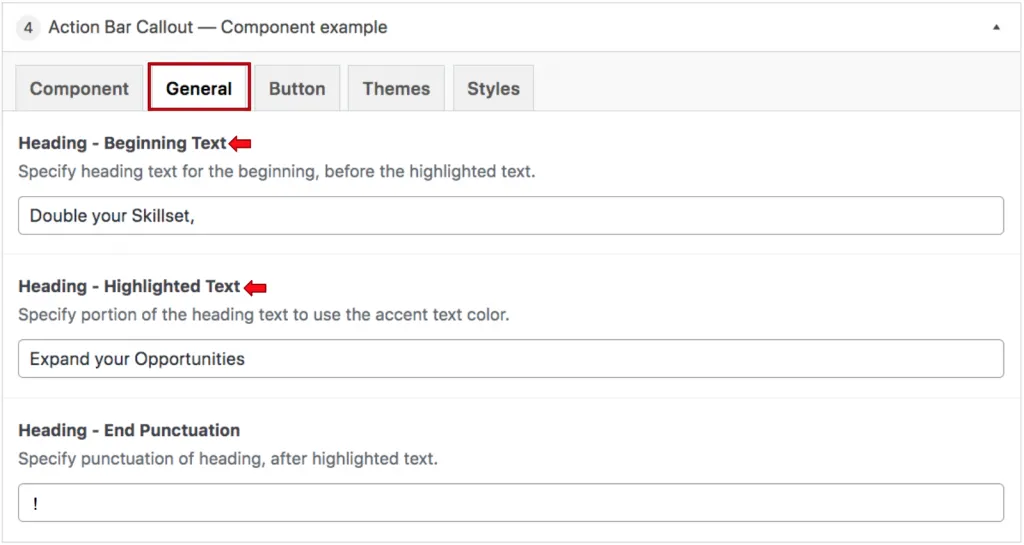
The next tab that users will see is the General tab, where they will add the heading text that will appear within this component. Content managers will see where they can input their Beginning Text which is the text that appears before the highlighted text. This is going to be the majority of your sentence text and will most often be in the form of a question.

They will then specify the Highlighted Text. This text has been designed to be a different color from the rest of the text so that it stands outs out to the user. This will usually be one or two words and should be the main focus of the sentence or question.
The final element to specify in this content section is the heading Ending Punctuation. For example, if a question is being asked, then this will be a question mark. In the example above, the ending punctuation is an exclamation mark.

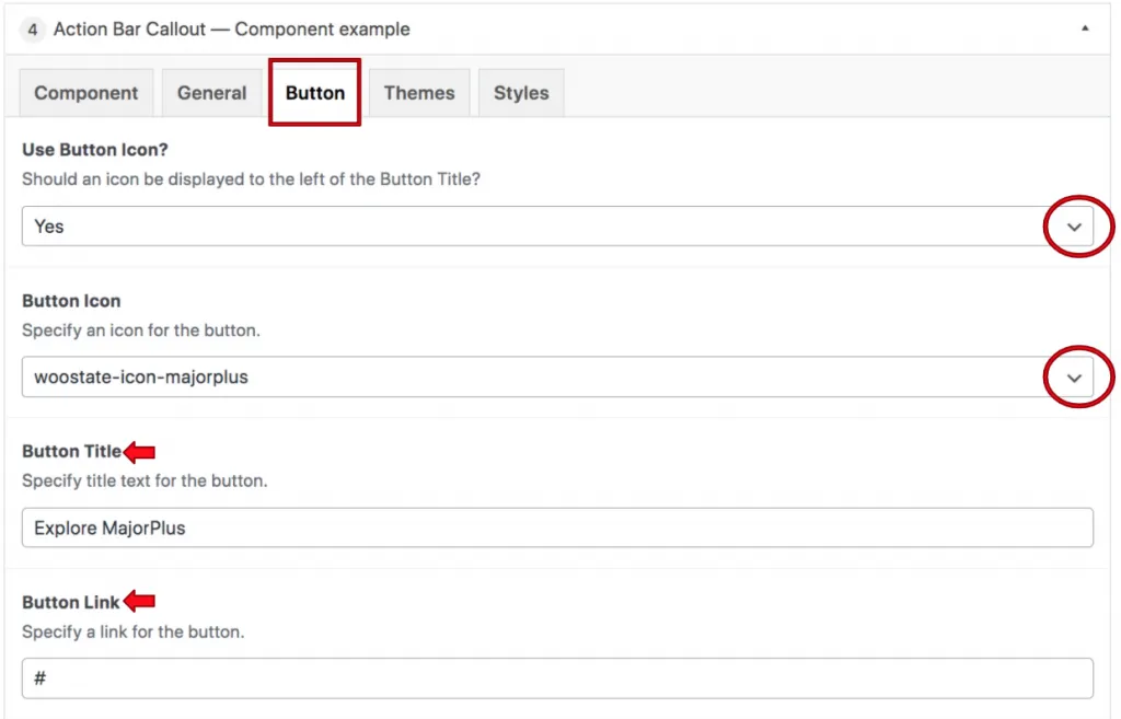
The next tab will read Button, and this is where the button icon and text will be decided. The first prompt a content manager will see is asking if the component should use the button icon. This is a dropdown field, and either “yes” or “no” can be selected. If “yes” is selected, they will see a field where they will specify the button icon they’d like to appear on the button. If “no” is selected from the dropdown, then the content manager will not see the field where they can select an icon for the button. The icon selected should be relevant to the intent of the Call-To-Action. In the above example, the majorplus icon is selected because the Call-To-Action is referencing the MajorPlus program.
The red arrows in the screenshot above point to the remaining fields within the button tab. These fields are for the button’s title and the link where the button is sending the user when clicked. The button title is the text that will appear within the button.
Suite A-258

