Icon Listing
Suite A-258
Quick Tips
- Always name the Icon Listing Section based on the content it contains so that content managers can easily identify the contents of the Icon Listing from the backend.
- Always check what the component will look like live on all devices using the Preview feature before publishing the update.
- This component is available on both Full Width and Sidebar Width content sections.
The Purpose of this Component
This component is designed to group similar content together but still allow for item differentiation by an icon. Titles are listed and when clicked they expand more information in the form of images and text. This allows the content manager to show a lot of content but allows the user the opportunity to click to expand if the topic interests them. Grouping like content reduces the amount of scrolling the user needs to do to get to the bottom of a webpage.
This is the Heading
How to Update this Component
When a content manager selects an Icon Listing component from the component dropdown list, they will see four tabs within the component’s settings. The first tab reads Component, and this is where content managers will name their components internally on the backend. This setting is for organizational purposes, and this information will never be public to users on the front end.
![]()
The next tab is the General tab, and this is where the Icon Listing’s heading will be identified and the description text. Both of these fields are optional, but content managers should remember that headings are an important element of SEO. This is why it is strongly recommended that this component be given a title.
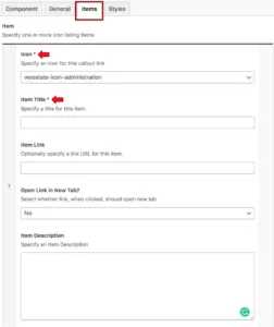
The next tab is labeled Items, and this is where the Icon Listing’s content will be added. The first thing that content managers will see when they click on the Items tab is a required icon field where they will select the icon they’d like to accompany the link.

Clicking on the dropdown menu will display a list of icons, which are labeled by what their icon looks like. Content managers can select which link they think best visually represents the link they are adding to the page. It is recommended that content managers only use an icon once per Icon Listing component so that icons are not repeated. If a content manager is unsure what each icon looks like, they can refer to this page of the Style Guide.
After a content manager selects the icon, they will then identify the item’s link and link text. This link can be to an additional resource, another internal page within the site, or a PDF. The link text should be short (3-5 words) to accommodate room for the link.
Content managers can add more icon listings to the Icon List component by clicking the blue Add Item button at the bottom of the component.
Suite A-258

