Grid Columns
Suite A-258
Quick Tips
- Always name the Grid Columns Component based on the content it contains so that content managers can easily identify the contents of the Grid Columns from the backend.
- Always check what the component will look like live on all devices using the Preview feature before publishing the update.
- This component is available on both Full Width and Two-Thirds Width content sections.
- The text added to this component will automatically format to the correct size when it is published.
- Two Grid Columns will be added by default when this component is selected.
The Purpose of This Component
This component is designed to bring the user’s attention to the featured text displayed within it. As the user scrolls down the page, they are met with text that immediately stands out to them.
Below are four different examples of ways in which content can be displayed within this component. In the first example, three columns are filled with textual content. The second example has two columns of content, and the third and fourth example only utilizes one column for textual content. The amount of columns needed will be dependent on the amount of content designated for this component.
Grid Column Example #1
This is the space where the content of the Grid Column will appear. In this particular example, the WYSIWYG content type is being utilized. Content managers will have more functionality of the text within this space if they select a WYSIWYG content type.
This is the space where the content of the Grid Column will appear. In this particular example, the WYSIWYG content type is being utilized. Content managers will have more functionality of the text within this space if they select a WYSIWYG content type.
This is the space where the content of the Grid Column will appear. In this particular example, the WYSIWYG content type is being utilized. Content managers will have more functionality of the text within this space if they select a WYSIWYG content type.
Grid Column Example #2
This is the space where the content of the Grid Column will appear. In this particular example, the WYSIWYG content type is being utilized. Content managers will have more functionality of the text within this space if they select a WYSIWYG content type.
This is the space where the content of the Grid Column will appear. In this particular example, the WYSIWYG content type is being utilized. Content managers will have more functionality of the text within this space if they select a WYSIWYG content type.
Grid Column Example #3
This is the space where the content of the Grid Column will appear. In this particular example, the WYSIWYG content type is being utilized. Content managers will have more functionality of the text within this space if they select a WYSIWYG content type.
Grid Column Example #4
This is the space where the content of the Grid Column will appear. In this particular example, the WYSIWYG content type is being utilized. Content managers will have more functionality of the text within this space if they select a WYSIWYG content type.
How to Use This Component
When a content manager selects a Grid Columns component from the component dropdown list, they will see four tabs within the component’s settings. The first tab reads Component, and this is where content managers will name their components internally on the backend. This setting is for organizational purposes, and this information will never be public to users on the front end.
The second tab is the General tab, where content managers can choose whether images added to this component are greyed out on the page. When the user hovers over the image, it will become colorized. This effect is only available if the content manager is adding images within this component. If not, they can disregard this setting, because it will not affect the component in the front end.
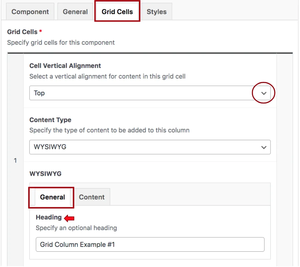
The next tab is the Grid Cells tab, and this is where content managers will add content within the Grid Column. When this tab is clicked, the content manager will see the component expand, revealing it’s settings and two additional tabs.

The cell vertical alignment settings are a dropdown menu, this controls how the text’s alignment will appear within the component. It is best practice to keep this selected at “Top”, and to keep this alignment consistant when adding new Grid Columns. The content type selected is WYSIWYG, and theses settings appear within the two new tabs. In the example above, the general tab is opened, and it is revealing the field where the heading of the Grid Column can be added.

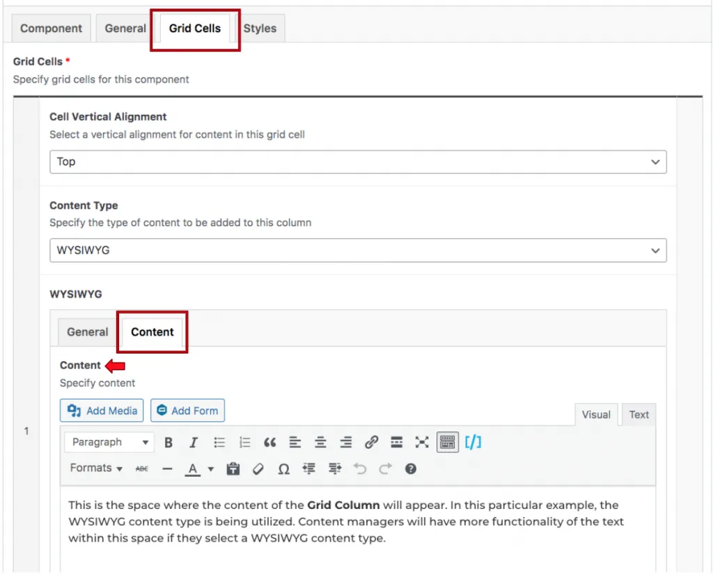
The two screenshots above are demonstrating what the back end of Grid Column Example #3 looks like. To add additional columns, the content manager should add columns to this component, and only fill in the Content tab. This allows for text to appear in additional columns without adding a header. If content managers wish to add a column of paragraph text and have textual content appear on the right, then they should add two columns, and only fill out the column #1’s header, and only fill out column #2’s content. This will achieve the layout of the Grid Column Example #4 in the above examples.
To achieve the layout of Grid Column Example #2, the content manger should add two columns, fill out the first column’s header and textual content, and only fill out the textual content of the second column. To achieve the layout of Grid Column Example #1, three columns should be added, with three textual content sections and one header in the first column.
Suite A-258

