Content Callout Blocks
Suite A-258
Quick Tips
- Always name your Content Callout Blocks component based on the content it contains–that way, you’ll be able to easily identify them from the backend.
- Always check what the component will look like live on all devices using the Preview feature before publishing the update.
- This component is available on both Full-Width content sections and Two-Thirds Width content sections.
The Purpose of This Component
This component is designed to bring attention to a group of like-content. The component is composed of a heading and tiles that contain their own titles and additional supporting content to further describe the title.
This component should be used if there are groups of related links that a content manager wants to add to a page. This component can also be used if the content manager wants to describe the title of the link block itself.
This is the Heading
This is the description text
This is the Block Title
This is the block content, it is a WYSIWYG in the backend, giving you functionalities similar to that of a Word document.
This is the Second Title
This is the second block content
This is the Third Title
This is the third block content
Fourth Block Title
Fourth block content
How to Use This Component
When a content manager selects an Accordion component from the component dropdown list, they will see four tabs within the component’s settings. The first tab reads Component, and this is where content managers will name their components internally on the backend. This setting is for organizational purposes, and this information will never be public to users on the front end.

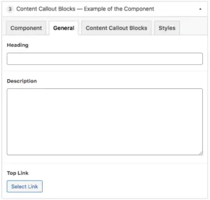
The tab to the right of the Component tab is the General tab, where the content manager can specify a heading, description text, and or top link for this component.

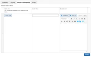
The Content Callout Blocks tab is where the content for the blocks will be configured. When a content manager clicks on this tab they will see where they can add rows to house each of the callout blocks. The first field they can add content to is the block link, followed by the block title and the block content. The block content field is a WYSIWYG, meaning that the content manager will have functionalities similar to that of a Word document. Additional rows of content can be added by clicking the blue button in the bottom left corner of the component.
Suite A-258

